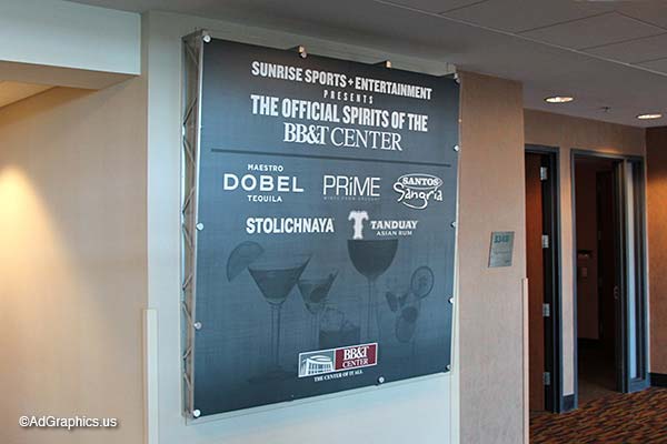
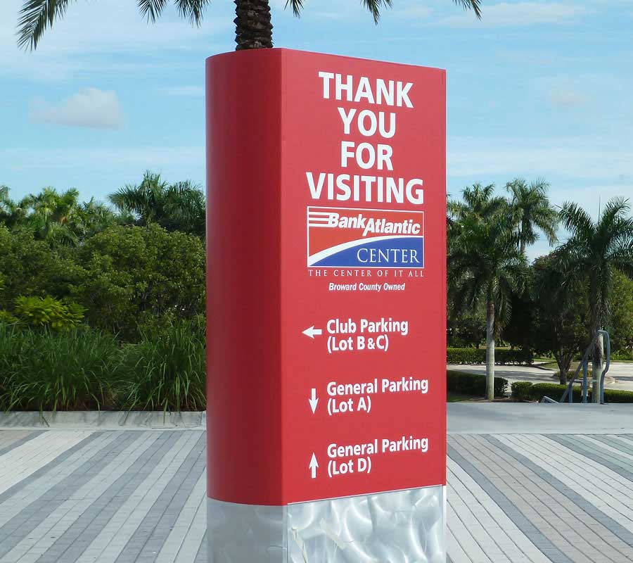
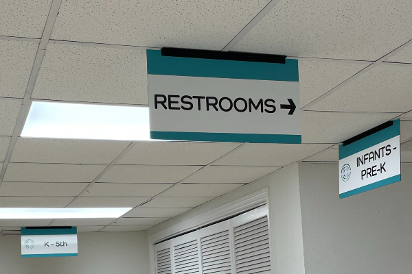
Interior wayfinding signs are used to help customers get from one place to the other with ease. In all large businesses, wayfinding signs are present. In all commercial buildings, exit signs are found. Some examples of traditional wayfinding signs include hospital directions, mall directories, and airport stickers on the ground to illuminate pathways. When designing the interior wayfinding signs for your business, there are a few tips and tricks to ensure that you’ll successfully communicate what you want the customer to know. At AdGraphics, we’ve assisted many South Florida companies in printing their wayfinding signs. Occasionally, we even lend a helping hand in designing. To learn more about the tips to consider, keep reading!
Use a Readable Font for Interior Wayfinding Signs
When using a wayfinding sign that includes wording, it must be readable. Of course, we all have our favorite fonts and types, but not all are suitable for the public. Some of the most common fonts used are Times New Roman and Sans Serif. These two fonts are known around the world, and readers don’t even think twice to consider their appearance.
Keep it Minimal
When designing a wayfinding sign, you’ll want to ensure that the sign is minimal. The reader will only want to do a glance. After all, they’re in a hurry to get where they’re going. If the sign has too many patterns or images, chances are they’ll get confused, give up, and bother one of your busy employees for help instead. To avoid the hassle, keep everything simple.
Be Clear with Communication
This is the area where wayfinding signs are most likely to fail. The reason being is that designing a wayfinding sign that is simple, yet direct, can be a challenge. At AdGraphics, this is why we’ve lent designing expertise to companies in the past. If there are images, they need to be clear. If there are written instructions, they need to be direct. If there are arrows, they need to be noticeable. Intertwining all of these aspects together can be complicated, but well worth it if it is executed properly.
Stay on Brand
Last, but not least, you’ll want to stay on-brand with your business. This includes using the proper color scheme, and the same tone of voice. If you are a playful atmosphere, then brighter colors are more likely you’re style. If you’re more serious, a monochromatic pallet is recommended.
Use Colors
Last, but not least, use colors to speed up the directional process. For example, red signs will let customers know intuitively that they should not go into that area, whereas green signs are a symbol of welcome. Choose your colors carefully and know that colors can send their subliminal messages.
If you’re looking for a seasoned team to assist you with the printing of your interior wayfinding signs, you’re in the right place. At AdGraphics, we’ve been in the business for numerous years, making us professionals in our field. We pride ourselves in offering some of the best materials available, while simultaneously using long-lasting colors. If you’re ready to communicate with your clients with ease, contact our team today at 1-800-645-5740.


