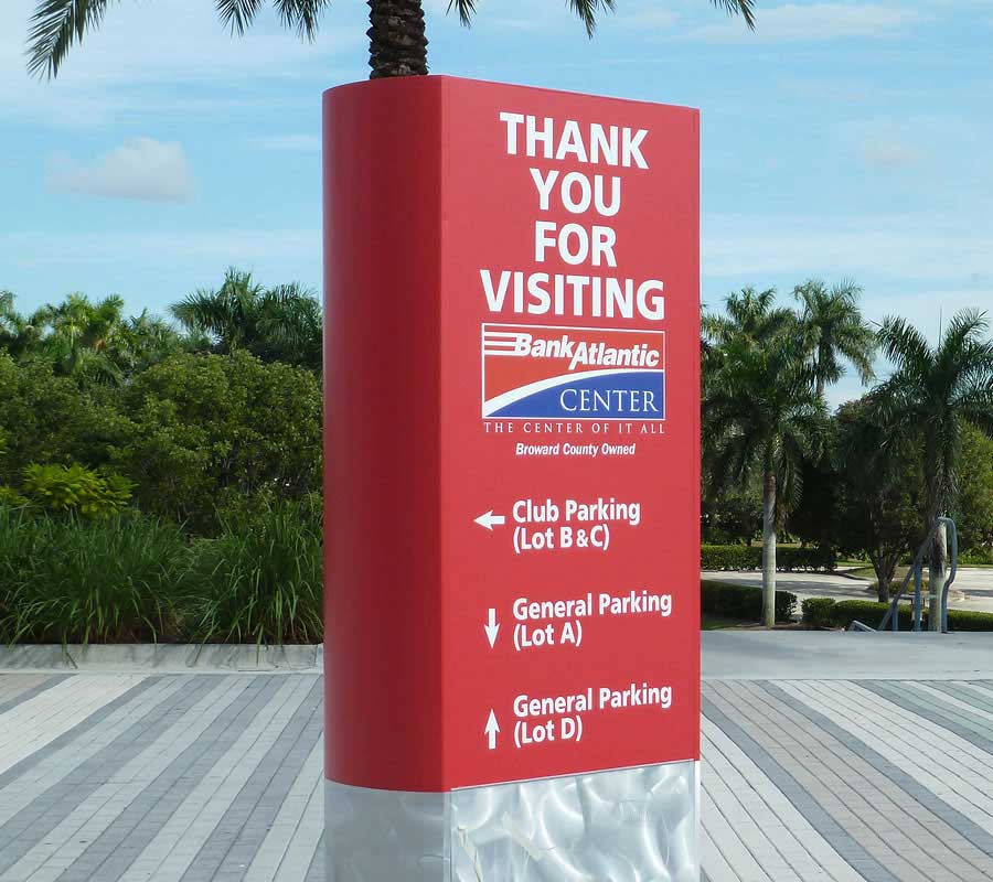
When you’re designing signage, you’ll need to ensure that you’re communicating the message you want clearly and correctly. The reason being is that wayfinding signage is designed for people to find their way without needing to ask for help. Not only does this free up your staff to do their jobs, but it also reduces stress for newcomers. Unfortunately, some companies don’t create clear communication on their signs, leaving more stress for new clients. These clients can then be frustrated and unfriendly to those they meet. At AdGraphics, we’ve designed and created our fair share of wayfinding signs so we know what works and what doesn’t. We’re here to help you create signage that will be clear, easy-to-read, and beneficial for all. Keep reading to learn more!
Tip One: Be Friendly
It seems strange to think that you’d need to be kind in your wayfinding verbiage, but the reality is that customers can read through subliminal tones and feelings. The idea behind wayfinding signage is that there are many subliminal messages that allow people to quickly and intuitively move forward to their desired location. Therefore, they do pick up on the tones and people are less likely to respond with kindness if they feel they are being pushed. Use positive colors, such as light tones and bright colors to stir positive feelings and avoid exclamation points as they can be read as loud and aggressive. Traditionally, wayfinding signage should be calm and easy to navigate.
Tip Two: Use Clear Fonts and Colors
An issue many individuals run into when creating wayfinding signage is text and colors. Either the font is hard to read, the colors between the font and background aren’t different enough, or the color seems to be too muted. When designing, it’s imperative that designers use bold, clear text that’s easy to read, both up close and far away. Colors, as mentioned above should be light in terms of the background, and text colors should be darker to give enough differentiation and provide contrast.
Tip Three: Place the Signs Strategically
When placing the signs inside of the facility, you’ll want to use install them like a map. Start with step one, which is a wide overview of where they’re going. You can see this in mall guides, where they show a visual image of the facility. Then, when reading below, customers can find the store they’re looking for based on matching the numbers. On these types of guides, it’s essential that you show the individual where they are currently so that they know which way to go. Let them see the layout of the facility, and then help them to move step by step. Point them in the right direction and give them positive reinforcement through similar signs as they go. This will help them to know that they’re going the right way.
Tip Four: Remember Your Colors!
Last, but not least, it’s important that you stay on brand with your own company. If you’re a store, you’ll want to use the same colors and fonts. If you’re a hospital, you’ll want to stick to more traditional colors. Whatever your brand colors are, they should be incorporated into your sign. If you’re creating signs that tell people to do something or not do something, go somewhere or avoid certain areas, use colors that reflect these decisions. For example, red is subliminally read as not doing something, whereas green refers to going ahead. Yellow generally means caution and white usually means all clear. Black could symbolize danger and blue symbolizes information. With this color pallet in mind, work to incorporate some of these hints for your guests, in addition to reinforcing text.
Contact AdGraphics Today!
If you’re looking for wayfinding signage companies, you’re in the right place. At AdGraphics, we’re happy to give you a rundown of what we believe are the best wayfinding techniques. When you’re ready to print, we have a wide variety of options to choose from, whether you’re looking for traditional methods or back-lit signs. Either way, we have what you’re looking for! Contact a member of our team today at 954-974-9900 and see how we can help your customers navigate your facility with ease and care.

