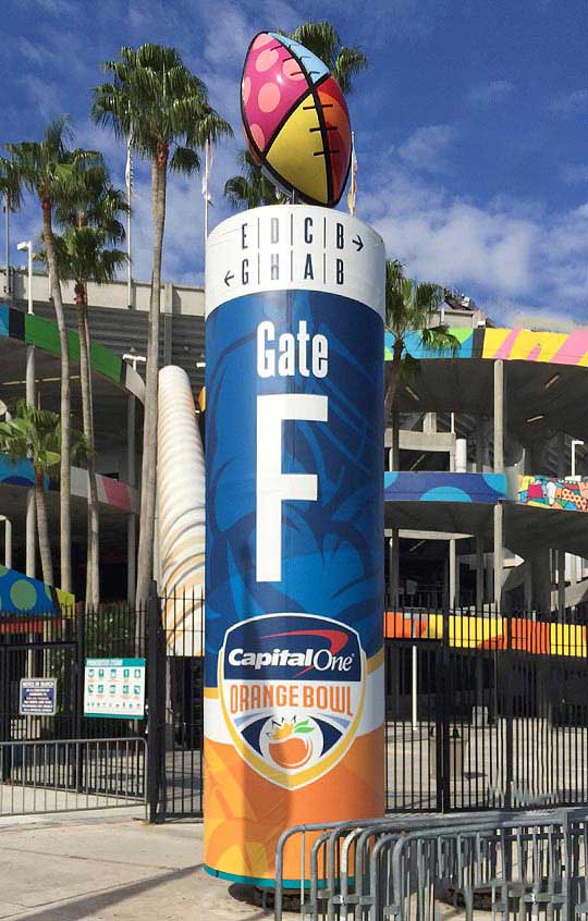
Have you ever been in a public place and found that you were incredibly lost? If so, you’re not alone. There are many people every year who end up in one place and find out that they really wanted to be somewhere else! Generally, this is due to the lack of clear directional signage. If you own a company, facility, or commercial location, chances are you use directional signage to guide people throughout the building. If you’ve found that your signage isn’t as effective as you’d like it to be, the experts at AdGraphics have listed a few of their top tips. Keep reading to learn more!
- Clear Fonts are a Must for User-Friendly Directional Signage
The first and most important note for anyone designing directional signage is to use fonts that easy to read, even from far away. Some individuals want to keep their wayfinding signage similar to their brands. However, there are some brand fonts that do very well on paper, and not so well on the large signs. Be cautious of what fonts you’re using. Are they useful, or will they simply be hard to read?
- Choose Minimal Colors
Another mistake that many designers tend to make is that they want to create signs that are vibrant with colors. This can be useful, especially for large red signs that indicate stopping, and large green signs that indicate moving forward. However, when designers use a plethora of colors or use patterns, this can get complicated for guests. They might be receiving mixed color signals, or they might not be able to read the font over the pattern. Keep the pallets simply, and the words bold.
- Don’t Color Confuse
As briefly mentioned above, it’s not uncommon for designers to accidentally mix the messages with the colors. For example, if there is a red sign that indicates a person should move forward, their subconscious mind is going to send out a red flag, which will then create confusion. The reason for this is that red symbolizes stop. It’s symbolized this way on stop signs, and at stoplights. Keep the colors consistent with their subconscious messaging. Red usually means stop, while green means go. Yellow can mean slow down or be careful, while lighter colors like beige are just tranquil background colors.
- Large Text
If a person isn’t very good with scaling text or images for large displays, the text on the sign could come out very small. To avoid this, you’ll want to work with a design professional to ensure that the measurements are right. The last thing you’ll want to do is create a sign that is hard to read up close, and far away.
- Use Symbols
Last, but not least, you can use symbols to get your point across. Some people use arrows or footsteps, guiding people on which way to go. These symbols are universal, meaning that anyone from anywhere will be able to efficiently navigate your facility.
If you’re looking for a company to help you with your directional signage, you’re in the right place! At AdGraphics, user-friendly directional signage is what we do, and it’s what we’re good at! Not only can we offer design advice for those who are new to the concept, but we can also guarantee that our prints, colors, and signage will last you a very, very long time. We believe that all people should have access to materials that are durable, efficient, and affordable. Contact AdGraphics today to get started on your direction signage at 954-974-9900!

